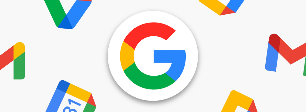
If Instagram decided to please its fans and returned its classic Polaroid icon only for a month, Google introduced a completely new logo for its Gmail mail service that will serve for much longer. The envelope logo has served as a symbol of the service for many years. Now it was replaced by the letter M with rounded corners.
The corporation made a major update to its logos in 2015, but the envelope logo has remained since 2004, so it is a truly landmark change.
The fact that Google is preparing to update the Gmail logo was known last month, and now it has finally happened.
Google announced the update of the logo using a presentation video about the renaming of G Suite to Google Workspace.
The stylized M, the new symbol for Gmail, uses the four traditional colors: blue, green, yellow, and red. Today, Google uses this color scheme for its products and services, including Google Assistant, Google Maps, and Google Photos.
The Google team considered more radical changes. They wanted to move away completely from the letter M Gmail's red color, but researchers did not take these changes well. At the same time, Google found out from this research that the Gmail envelope icon is not an important design element, which allowed the team to experiment with keeping the M and adding the traditional Google color palette.
Simultaneously, Google updated the logos for the Calendar, Docs, Meet, and Sheets apps in the same style.
Google is trying to combine Gmail, Chat, and Docs to compete with Microsoft Office and its Outlook email service.


