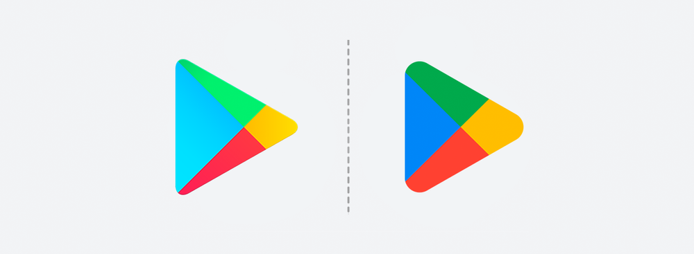
Google has updated the logo of the Google Play Store to celebrate the 10-year anniversary of its online store for Android apps, the company's blog post reads. Google Play was launched back in 2012.
This year marks our 10th year of Google Play-ing. To celebrate, we're offering Play Points members a 10x points boost, starting today. How has it been a DECADE 🤔🤯🤔 Claim your points boost here: https://t.co/xoVIQsxHns #PlayTurns10 pic.twitter.com/76pQbQqDBY
— Google Play (@GooglePlay) July 25, 2022
The tech giant also revealed Google Play's statistics, noting that the service is used by more than 2.5 billion people in over 190 countries every month. Moreover, the platform offers content from more than 2 million developers who work with Google to grow their business and reach people around the world.
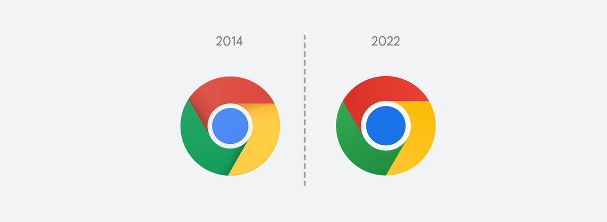
As for the new logo, it retains the shape of a triangle, but its corners are more rounded. The most visually noticeable changes are more vibrant and saturated shades of the traditional four-color scheme (green, yellow, blue, and red) that lack the previously used gradients. These subtle visual adjustments also complement the new Chrome logo, which the tech giant refreshed earlier this year.

According to Google, the new logo "better reflects the magic of Google and matches the branding shared by many of our helpful products — Search, Assistant, Photos, Gmail and more."


