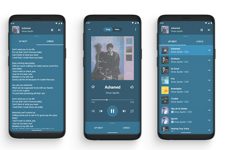
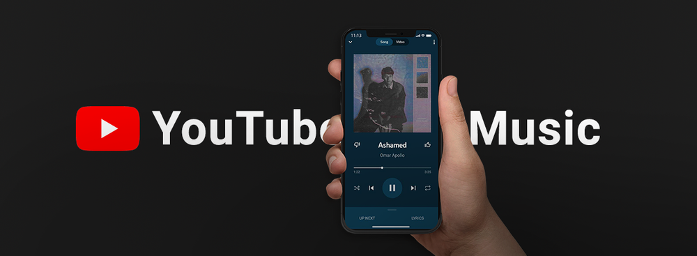
Google has redesigned the YouTube Music mobile app for the Android platform. After several weeks of the testing period, users finally have access to the new Now Playing screen, which is displayed while playing music.

The updated design offers additional controls: at the top of the screen, you can switch to the playback mode of music or music videos. At the bottom of the screen, the Up Next and Lyrics buttons have appeared. The first of them allows you to view the playback queue. Earlier, the YouTube Music application showed the name of the next song in the playback queue at the bottom of the screen, and when you clicked on it, a list would open.
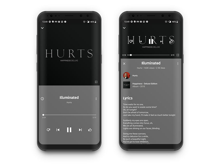
Some users, however, can only view the lyrics if they tap the "Info" button.

The Lyrics button is still an experimental feature and may change in the future. It allows you to view the lyrics, but so far, it only works with some songs. The layout of some other controls has also been changed.
The updated Now Playing screen is already available in the latest version of the YouTube Music app for Android. But the global deployment of this version may take several days because not all users have these features available at the moment. Corresponding design changes in the iOS version should appear soon.


