
In Handy Tips, we find ways to improve your life and make it easier and explain why these tips work. Today, we will tell you about simple poster generators and sources of inspiration for creating a perfect poster.
Creating a poster is a rather laborious and tricky process. The designer needs to feel the customer's mood, take into account many details for the text to be perceived by the viewer correctly, and clearly convey the message. In this article, we have collected sources of inspiration, useful generators, and tips for creating a good-looking poster that can reach and fascinate the end consumer.
Here are some of the poster generators you can use:
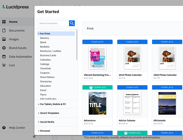
1. Lucidpress
How to Create a Cozy Workable Home Office
The coronavirus pandemic made a lot of people move from noisy open space offices to their homes. To create a comfortable home office, you may need to go through a checklist of things necessary to make it feel suitable for productive work from home.
 Lolly Page
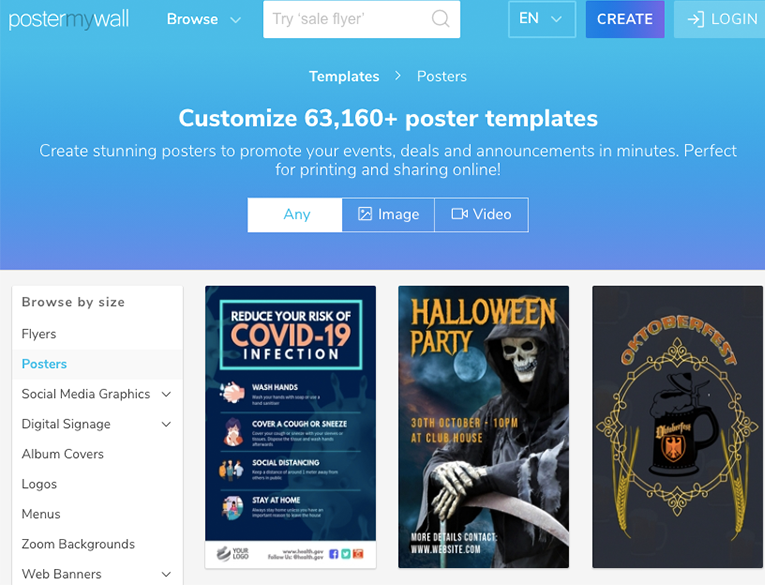
2. Poster My Wall
Here are some inspiring Pinterest accounts that might help:
- Sandi Dusel DESIGN & POSTER ART
- K. Holt Typography
- Cindy Martin Typography
- Graphic Design Junction Typography Design
How to Learn to Play Musical Instruments
Learning to play any musical instrument is quite a rewarding and stimulating activity, so choose an instrument that you like and enjoy the process of learning. In this article, we will tell you how to learn to play musical instruments using these 7 apps.
Lolly Page
4 simple rules for creating posters if online generators aren’t enough for you:
- Pay attention to who you are making the poster for. A clear understanding of which audience you are addressing is the key to creating a successful poster. Advertising for a bank or conference requires strict forms, while a DJ set poster requires a relaxed and quaint style and font. What is appropriate on one poster cannot be represented on another. Name five characteristics of the people you are making a poster for, and try to find fonts that fit those characteristics.
- The text must be readable. The perception of the text is your top priority. Avoid flowery fonts – they can convey a certain mood and aesthetics, but this does not make sense if the viewer has to concentrate for a few seconds to understand what is written on the poster. It is also essential to pay attention to the size, letter and line spacing, and color combination. Working with the same font of the same color, you can create both perfect texts in terms of perception, and completely unreadable.
- Don't overload the poster. Most often, two fonts are enough for one poster. If you use more, you get a heap of text, and the poster will not be perceived as a whole. The same goes for colors. Using color too generously can scatter the viewer's attention and distract them from the text.
- Rules can be broken. Creativity can’t be confined. It's weird, for example, to make a rave poster without flashy acid colors. However, it is crucial to understand why the poster should look like this and not otherwise, so that it looks adequate and harmonious in the context.